
Gold Award
cai
Fetching the Moon
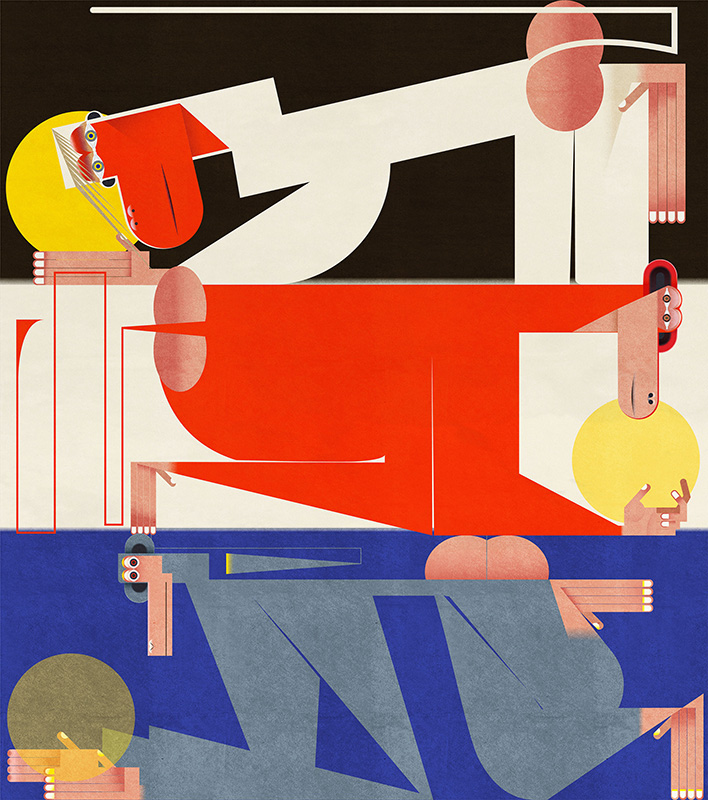
Fetching the Moon
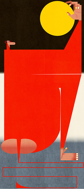
Fetching the Moon

Fetching the Moon
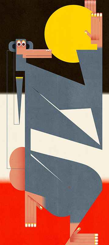
used art supplies or application softAdobe illustrator Artist commentsWYX is a contemporary Chinese pastry brand. |
審査員評The animals are beautifully stylized into almost geometric shapes that are nicely placed in the composition, this composition exudes strength and tranquility! Steven-Van-Hasten This is a very special job. Amire Alaei This series of illustrations is very original, playful and strong compositionally. Laimute-Varkalaite Cai's illustrations are remarkably unique. Tran Nguyen とても個性的な作品。 蟹江隆広 |
| ホーム | 仕事依頼 | ギャラリー | 入会ご案内 | 公募展 | 年度賞 | 作品集 | 活動内容 | メールマガジン | 会員リスト | 組織概要 | リンク集 |
このサイトに含まれる全ての画像の無断転載を禁じます。
Japan Illustrators' Association / Illustration gallery / Illustration competition / Illustrator of the year
Every art and illustration in this site must not be reprinted without permission by JIA.